Have you been following along in the Client Diaries series?
There have been many posts showing all the different room reveals over the last few months…
Today I am sharing the kitchen…
Do you remember where we started???
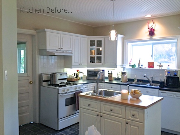
When I first met with Jess and Brad they had already put quite a bit of effort into their cottage kitchen.
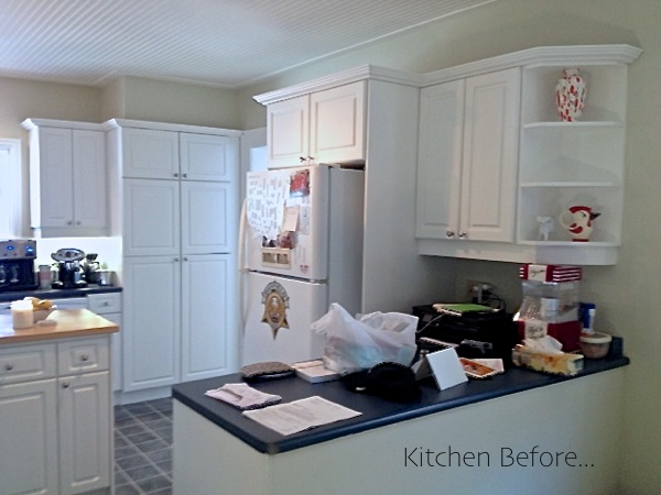
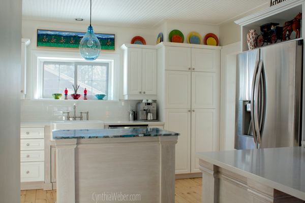
They had painted out all cabinets and walls. They also added beadboard to the ceiling to match the dining room.
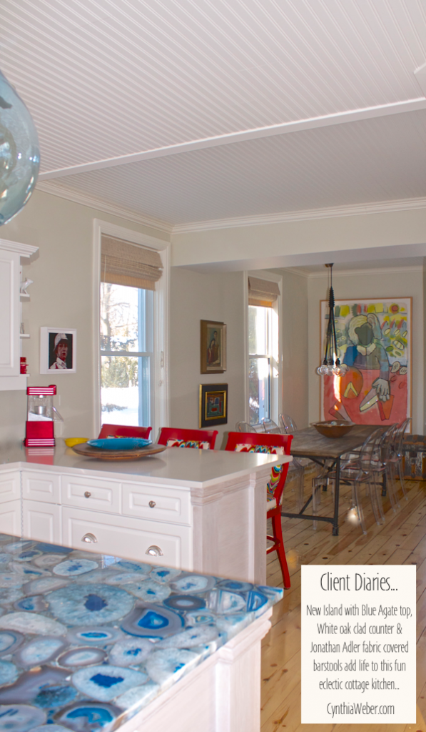
The layout worked well for them but they wanted to upgrade the fixtures, some of the cabinetry including the island and changeout the backsplash tile. We also decided to extend the counter on the dining room side to allow for counter stools.
Oh… and Jess was dreaming of a farmhouse sink!
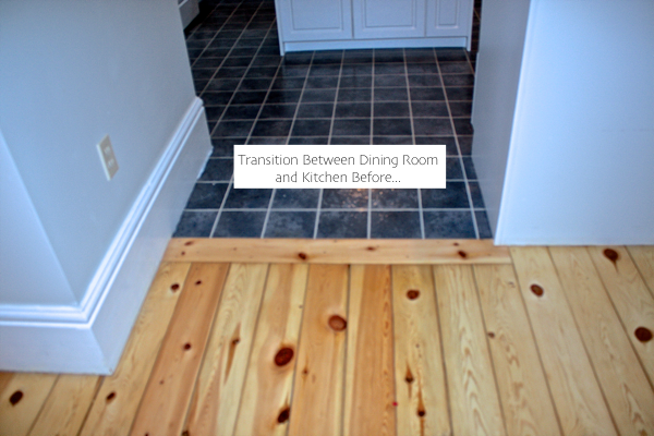
The flooring was dated and cut the room awkwardly… so we decided to lay pine to match the existing dining room pine and create better flow.
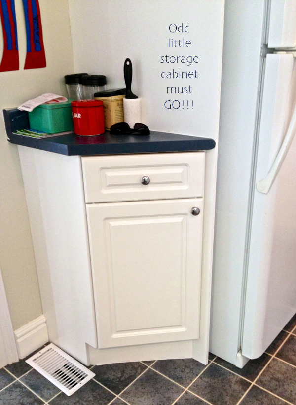
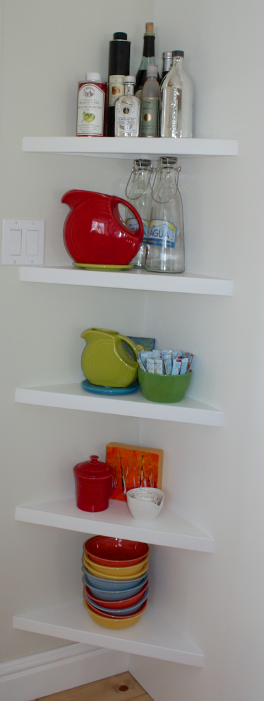
Also, this corner beside the fridge wasn’t attractive.
I thought simple chunky shelves would add interest without cutting the room so much.
Now for the design elements…
We decided to create a classic background with stunning pops of colour to compliment their extensive and varied art collection.
Jonathan Adler fabric mixed with fiestaware was also part of my plan…
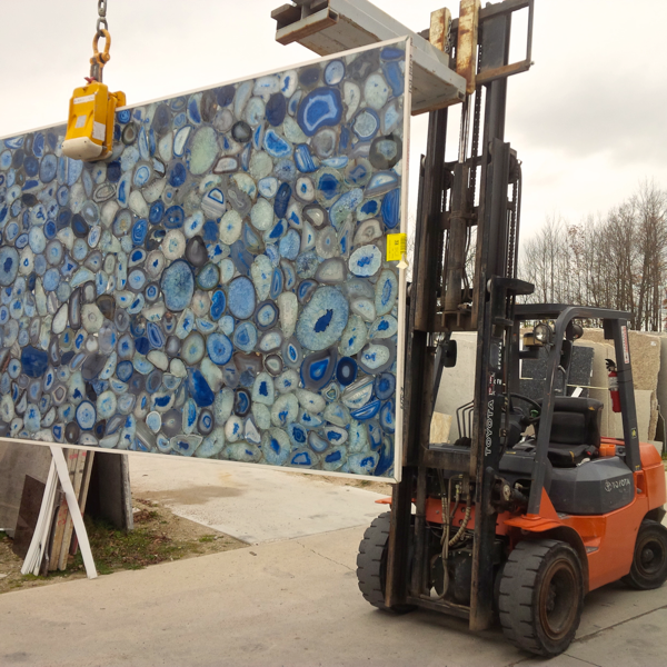
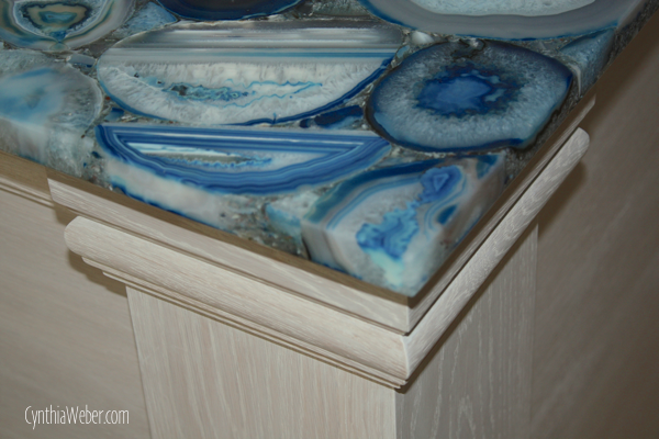
Oh… and don’t forget about that amazing island top…
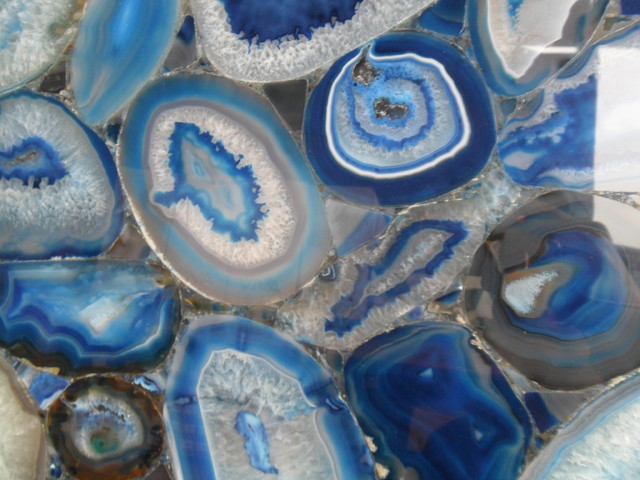
Concetto Blue Agate from Caesarstone!
It is unreal… honestly, I knew it would be beautiful and unique… but, in person…
It is breathtaking!
I could just stare at it all day!
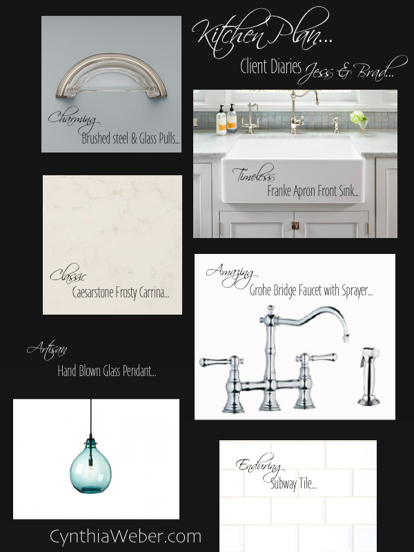
Here are the other elements we settled on…
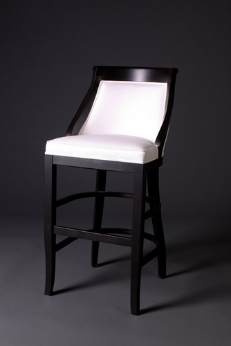
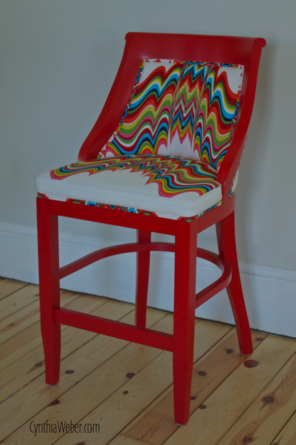
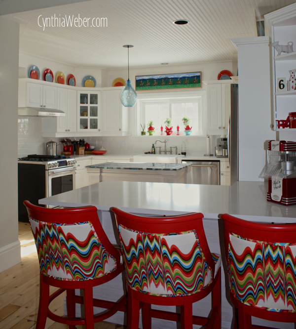
I chose this counter stool frame from Gresham House Furniture and had it done in a custom painted finish…
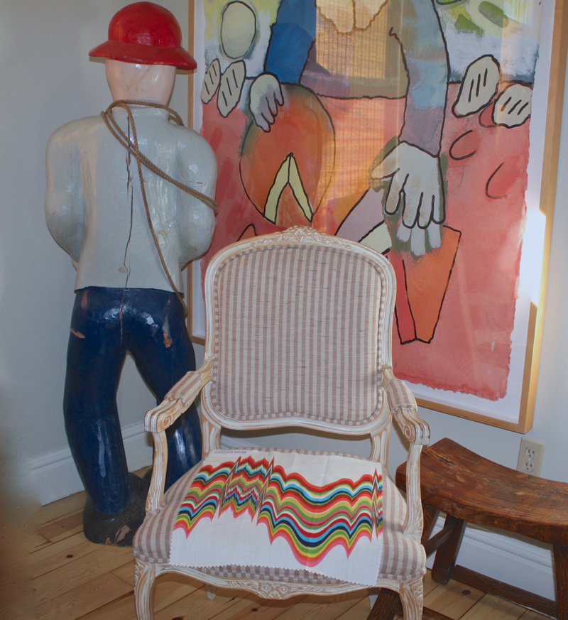
Upholstered in this lively spirited fabric called Distorted from the Jonathan Adler collection for Kravet.
I know you can’t wait to see it…
Hang on!
First I want to talk about the new cabinetry…
We had a local mennonite cabinetmaker build the island and new sink base in white oak. I wanted to clad the exsisting peninsula in the same white oak and have new kickplate made for all around the kitchen to connect everything.
Another trick we used to connect things was to take a piece of the original baseboard from the cottage to the cabinetmaker. He had knives set to reproduce that same profile and we used that for the trim around the island and peninsula bases.
All new cabinetry was given a whitewashed finish.
Ok…
First things first…
Hello Beautiful!!!
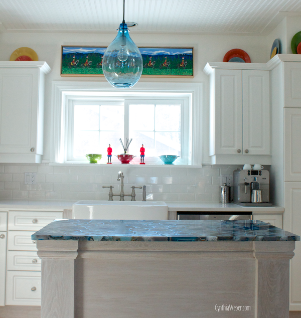
Now a peek at that Blue Agate on the custom island…
I am in LOVE!
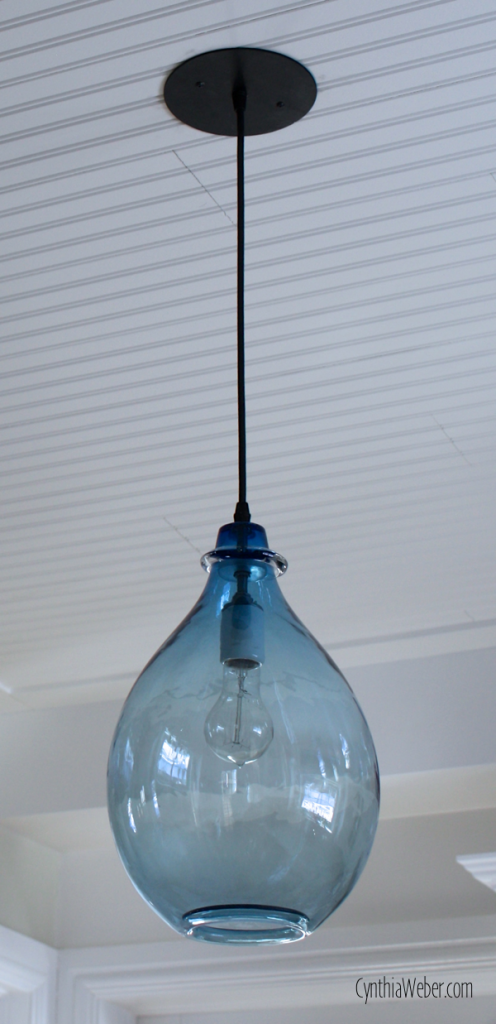
And what about that Blue Glass pendant…
Be still my heart!!
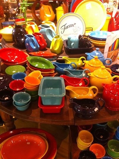
Jess already had some Fiestaware in her collection.
I went to Watson’s Chelsea Bazaar an amazing shop in Stratford Ontario to add a few more pieces.
Watson’s is a wonderful place to go and wander around. They carry beautiful lines from around the world… Well worth the trip!
So, now you have seen the barstools and a peek at the island and a preview of all the other elements…
let’s get to the reveal!
I don’t know how anyone could be sad in this space…
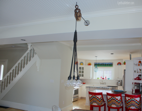
If you saw our redo of Jess and Brad’s bedroom you will notice we used a similar antique pulley in the dining room to swag the light fixture over.
This allowed me to move the dining room table down creating more room at the bar area.
Notice the beautiful painting above the sink?
It is one in a series featuring the Canadian Mounted Police done by Maxwell Newhouse a highly regarded artist and writer from B.C. Canada.
Mr. Newhouse also crafted Woody the life sized carving that sits in the entranceway of Jess and Brad’s cottage.
You may recall that he was freaking me out during the reno so I gave him a time out…
He is back in his rightful place now.
We have come to an understanding!
I love how these simple shelves turned out.
They are modern without being stark.
I love this bright and cheerful kitchen!
It is filled with whimsy, colour and creative energy.
I hope you like it too!!
I am sharing this project at: Our Sunday Best Showcase,

