Happy Dance!…
The Kitchen is Finished!
My friend Erin from A Simple Photo came by and took some photos last week.
She got some great shots so I thought I would share them with you today.
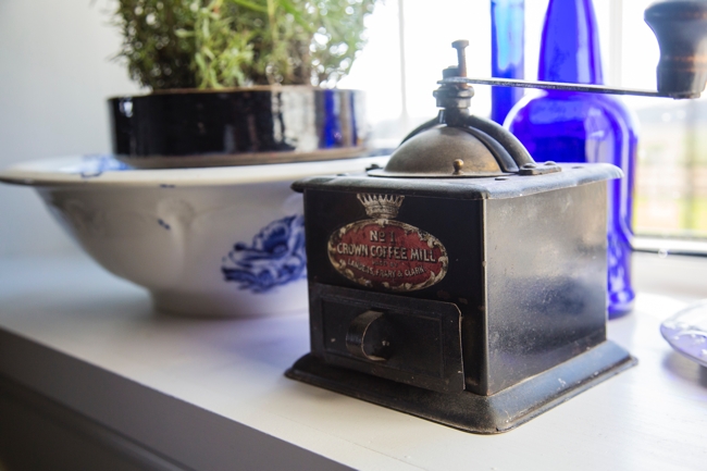
This little coffee mill has been a part of my life since childhood.
I remember grinding up cheerios in it.
After I got married it came to our first house and when we had our son Spencer I remember grinding cheerios in it with him…
I think it is a fitting piece to have in the kitchen windowsill here at BannockBurn 1878.
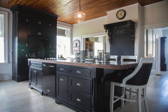
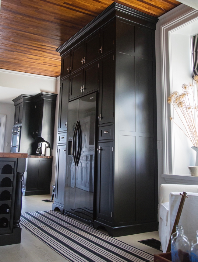
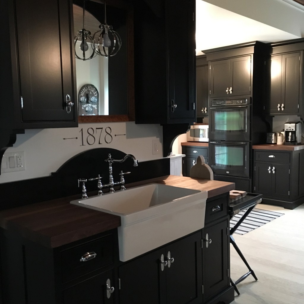
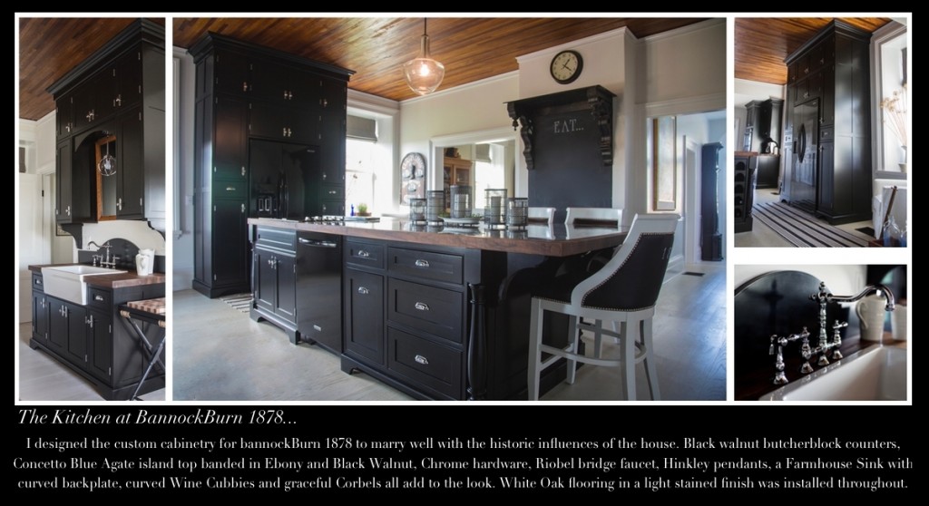
Designing a historically sympathetic aesthetic while incorporating modern functionality was the goal for this kitchen.
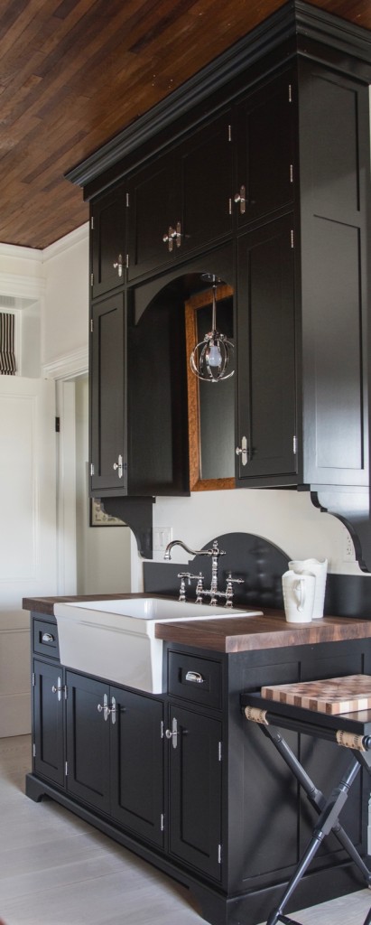
We wanted the cabinets to have a farmhouse feeling. Shaker panels, exposed hinges, curvy cutouts and corbels all added to that look.
Choosing the whitewashed white oak flooring for the whole main floor and painting walls and trim in very pale colours gave me the ability to bring in black cabinetry.
We chose to keep the existing wood slat ceiling in its original finish.
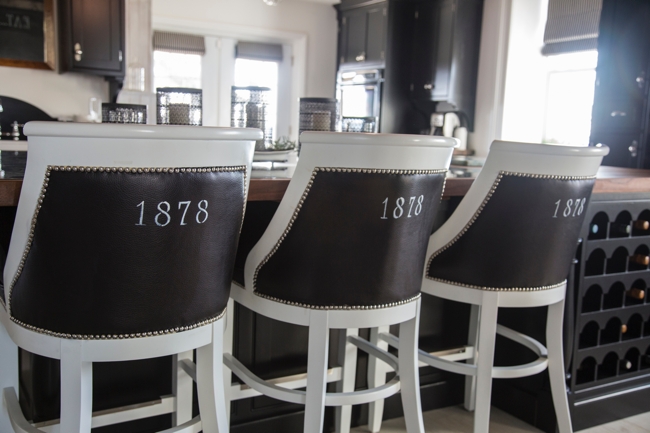
If you missed the post where I dyed these yellow leather barstools black…
( yes, it was nerve-racking!! ) Here is the link to that post.
I need to give a special shout out to the wonderful folks at Yankee Stencils. I had purchased a set of alphabet stencils from them and used them to stencil 1878 on the back of one of the stools. With the renovation in full swing I put aside the project doing the other three stools. I went to finish a few weeks ago and realized that I lost the stencils!! They were kind enough to send me through another set so I could finish. I appreciated it greatly and am very pleased with the results. ( I did not receive compensation for this post and the opinions of their product are my own )
I have also used this same font for the compass project in our Client Diaries series.
Maximizing space and making use of the ceiling height motivated me to design the cabinets right up to the ceiling. The extra storage is amazing!
Wine cubbies with curvy hoop tops fit beautifully with the theme. I had recently designed these cubbies for a reception desk I designed for the Little Inn project. I was so taken with how effective they were I decided to incorporate them in a new way for our own kitchen.
The sink cabinet is my favourite part of the kitchen. I wanted something unique and with limited wall space I had to get creative!
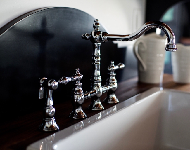
I chose to add a curved backplate to the farmhouse sink. The bridge faucet from Riobel with its feminine curves echoes the curves in the backplate, wine cubbies, corbels and cutouts…
These curves are an important balance to the black cabinets with their masculine presence.
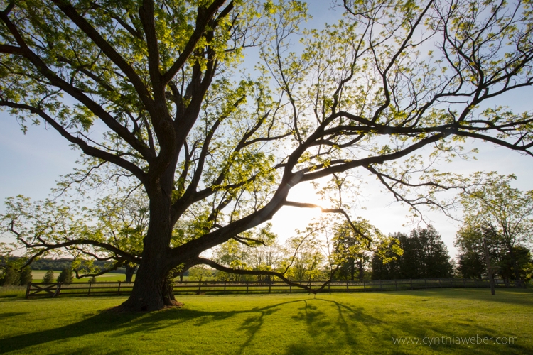
If you follow this blog you will know about the huge black walnut tree in the backyard…
The tree is such an important part of this property.
It brings us constant joy with the changing seasons.
We thought it would be a fitting tribute to have black walnut butcher block counters in the kitchen.
I love how these feminine and masculine elements work together…
It is as they say… A Happy Marriage!
One element of the kitchen that I have added since this photo shoot is the stencil over the sink backplate…
I think it gives it a finishing touch!
If you would like to see other posts about this renovation…
Just before I go I will add a few other photos from Instagram which I have not put on the blog yet…
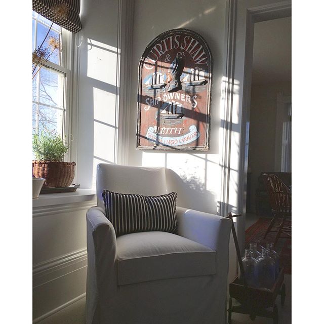
My favourite place to sit and watch sunset…
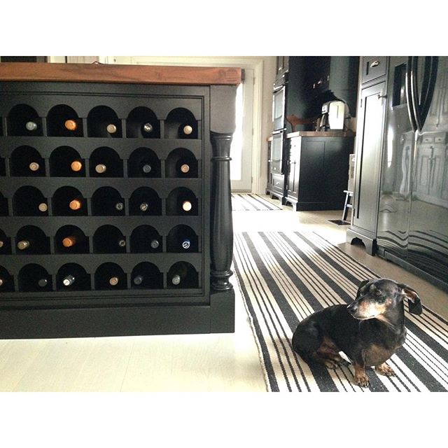
Emmitt enjoying the Dash and Albert runners…
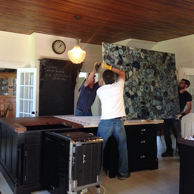
Lifting the Caesarstone Concetto Blue Agate slab onto the island. After it was laid we surrounded it in the black walnut and added an ebony banding. I promise to get some better photos of the agate… It really is quite extraordinary!
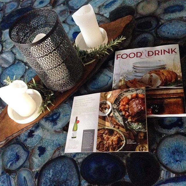
A close up of the agate…
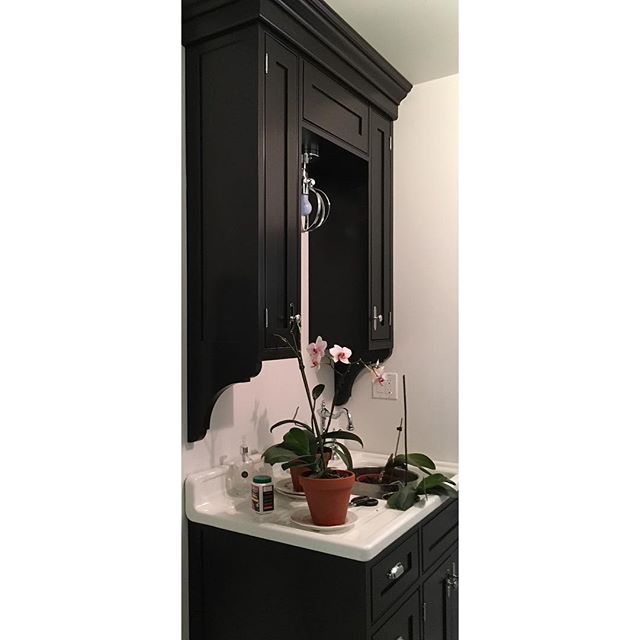
The matching cabinets I designed for the powder room. This vintage sink was re enamelled … If you want to see how that went… Give a click!
and if you are Pinner…
Please feel free to pin away!!
